![]()
![]()
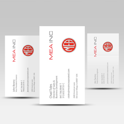
MEA came to Beyond Design for a complete overhaul of their brand – including a refreshed letterhead, business cards, spec sheets, brochure, envelopes, email signature, logo, badge, animation, and website design.
Creating a Consistent Language
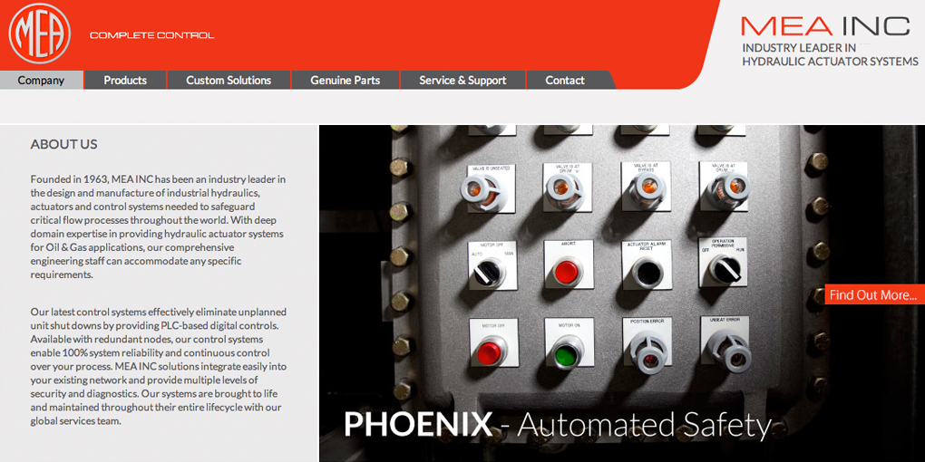
Since 1963, MEA Inc. has been an industry leader in the design and manufacture of high performance industrial actuators needed to safeguard critical flow processes throughout the world. Their products are used in the utility, refining, and steel industries. Looking to improve the perception of their brand and show off the vision of their new ownership, a consistent language was imperative throughout the branding process.
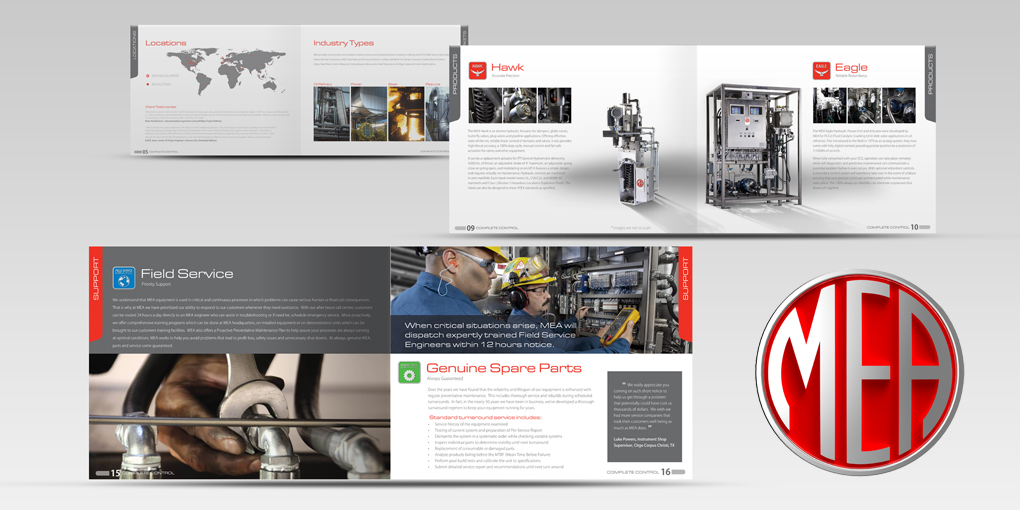
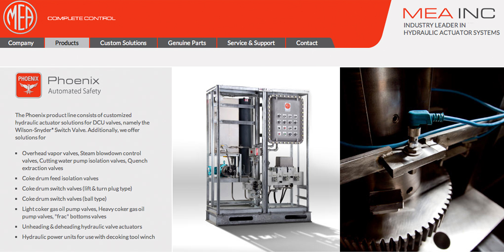
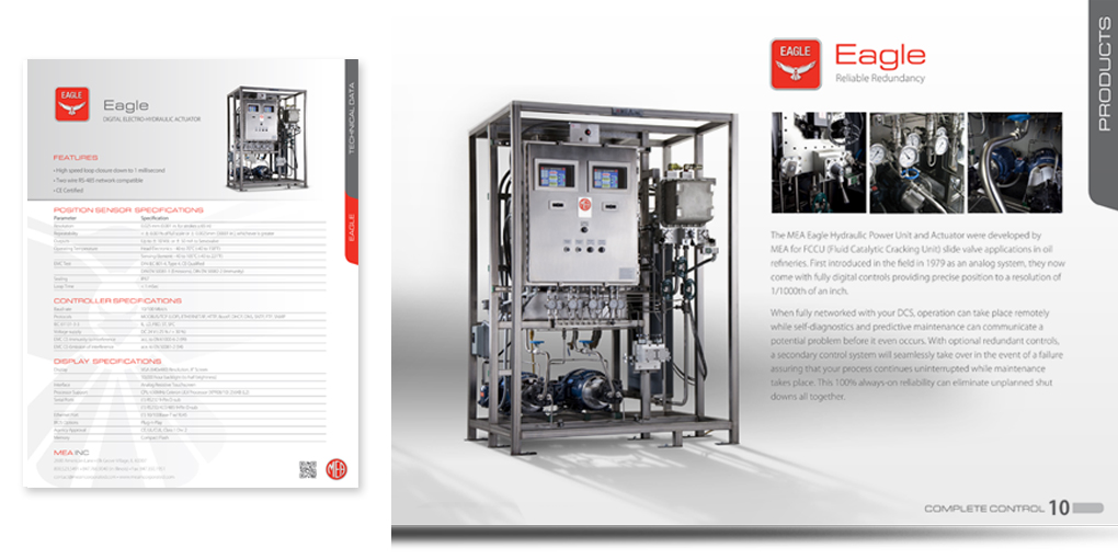
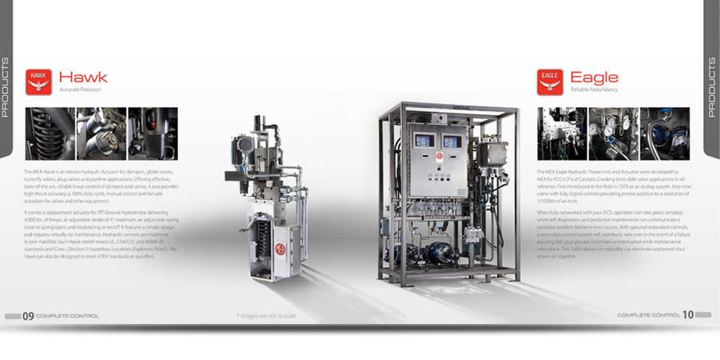
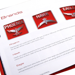
Visual brand guidelines were developed for all marketing communication materials and used to assure a consistent brand message was delivered. Design attributes had to portray a premium brand to heighten the company’s reputation for reliability. Our team examined every aspect of the company’s identity, including its brand architecture and their three primary actuator products – the Eagle, Phoenix, and Hawk. A consistent color strategy was applied across all materials to further establish distinction from the increasing competition and provide added visibility.
Streamlining the Information
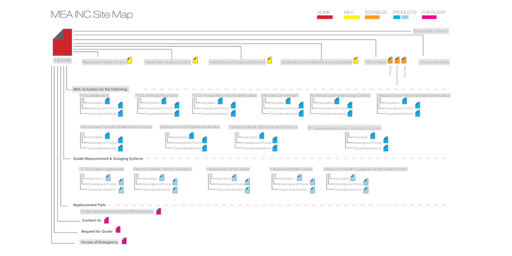
One of the major tasks our team faced was to streamline the multitude of complex information and reduce the number of pages by nearly half of the previous website. The client wanted an intuitive navigation with a clean look and the ability to update text and photos as needed. Through design exploration, a simple navigation scheme was devised as well as making sure all services and products are properly communicated. The final website design has a modern look and has reestablished MEA as the premium actuator company in the world. In addition, the site is accessible globally, with a sister site created in Spanish.
Dynamic Photos Set the Scene
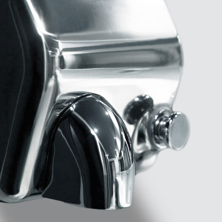
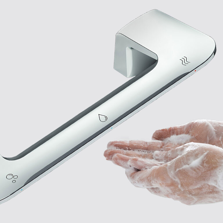
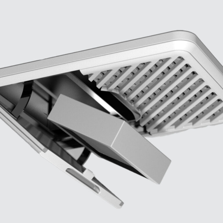
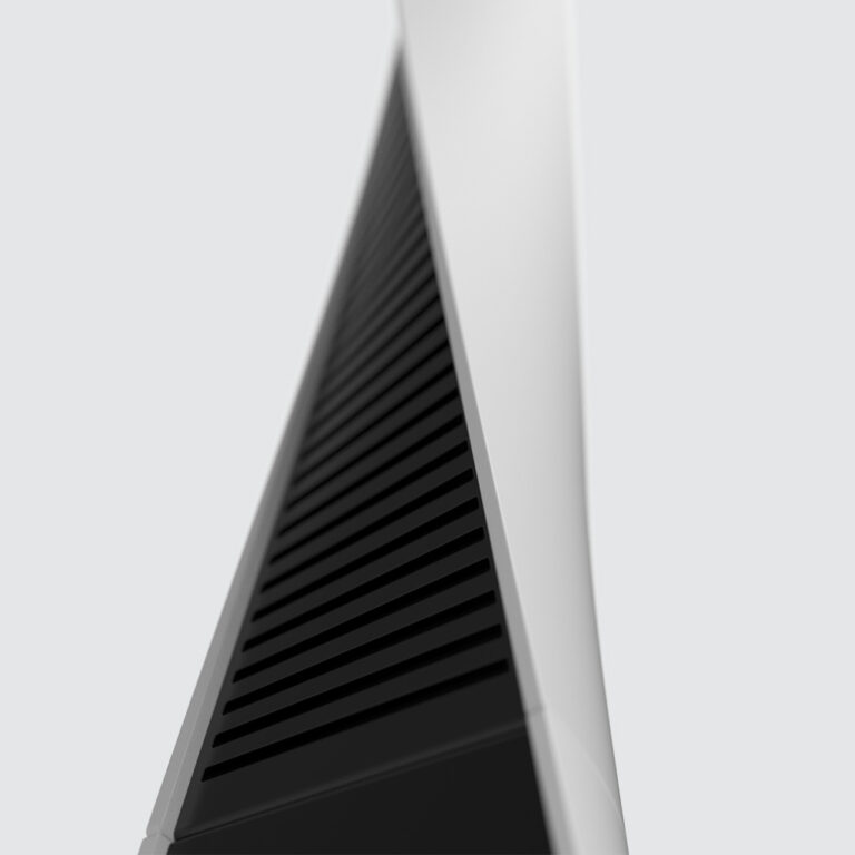
By shooting dynamic product angles, a more striking appearance was created for our client’s product line. Initial storyboards were shared with MEA to project our design vision and provide art direction for the photography that would be used to further elevate the MEA brand. The products were brought to life through close-up, vivid images that showcase the details of each product and allow the user to recognize the features and benefits. We also included videos that were created by our animation team to explain the technical aspects and functionality of the designs.
Defining Platforms and Information Access
All necessary page templates were developed in accordance to strict Web standards and are search-engine optimized. The WordPress platform was selected to fulfill our client’s goal of making it easy to update material on the site. Visitors have the ability to access PDF’s of spec sheets, press releases, brochures, and additional information. The complete overhaul of MEA’s brand expresses the company’s ongoing commitment to innovation and reliability.
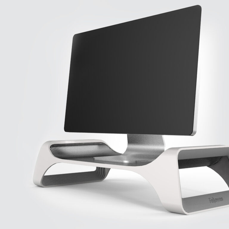
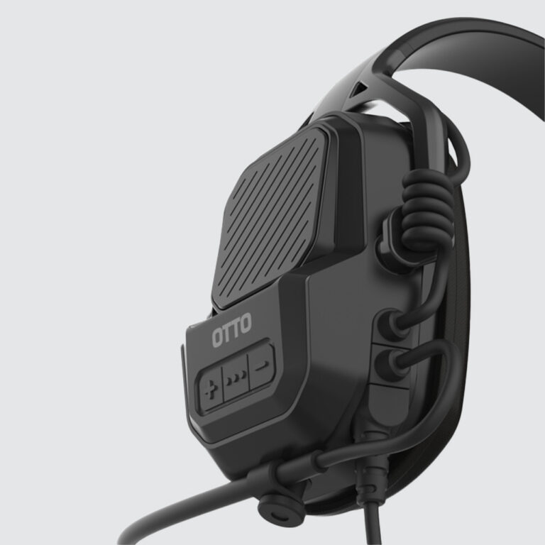
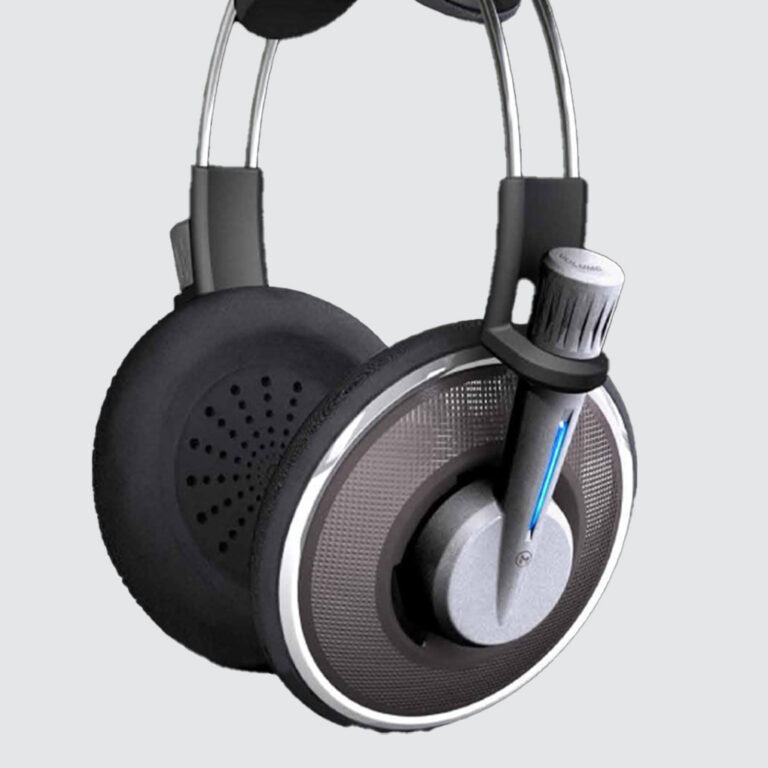
 Consumer Electronics
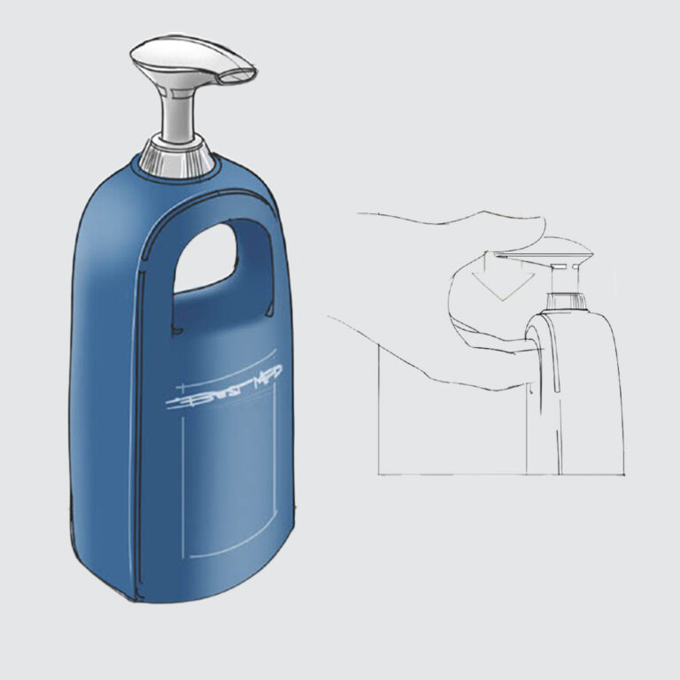
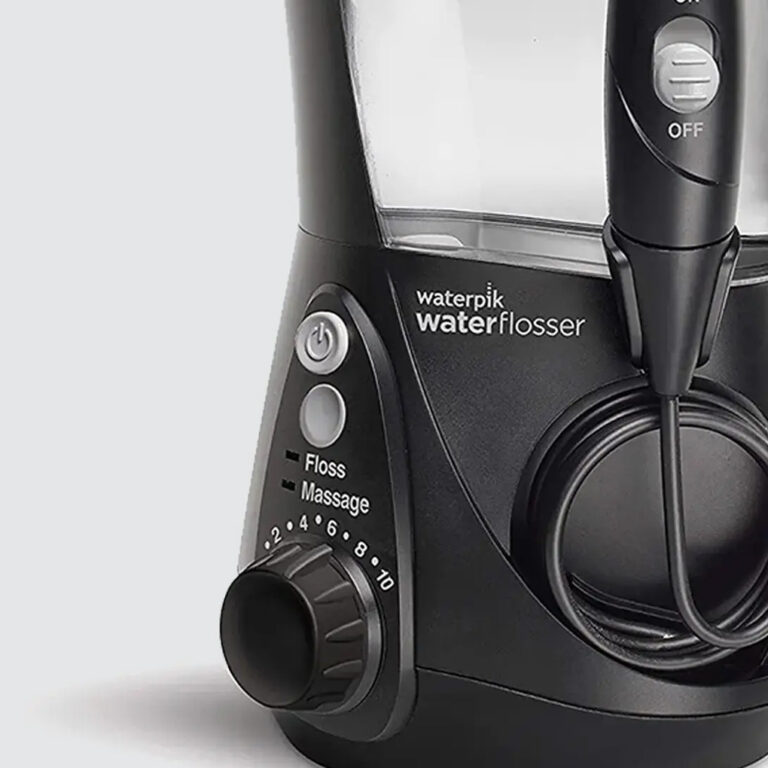
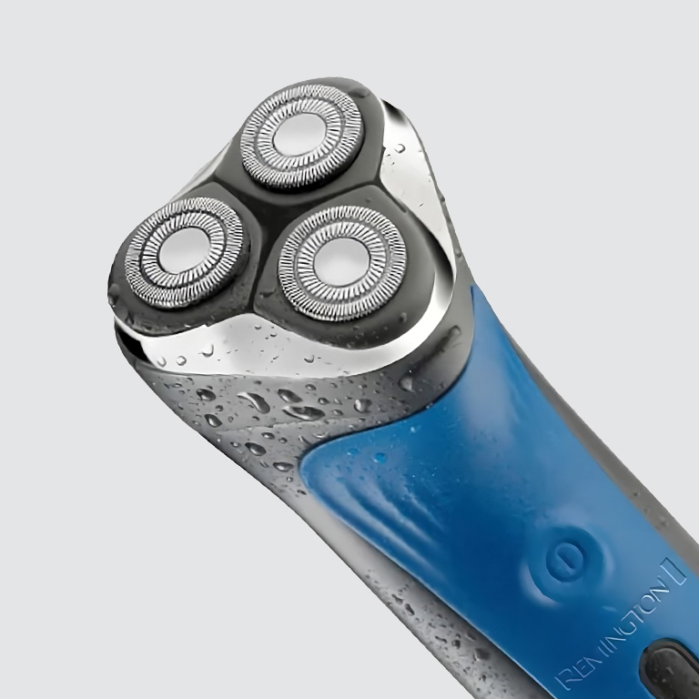
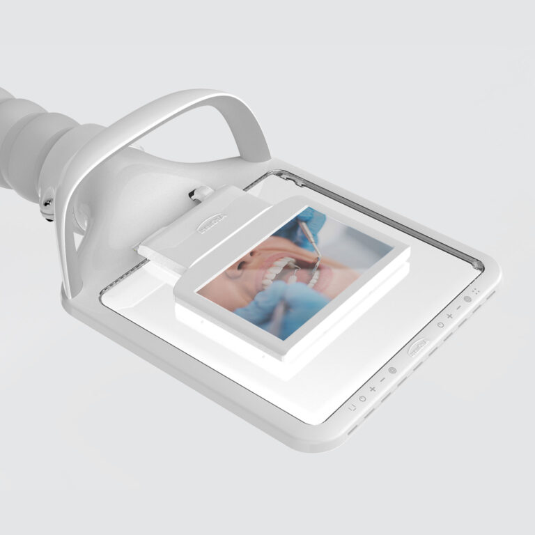
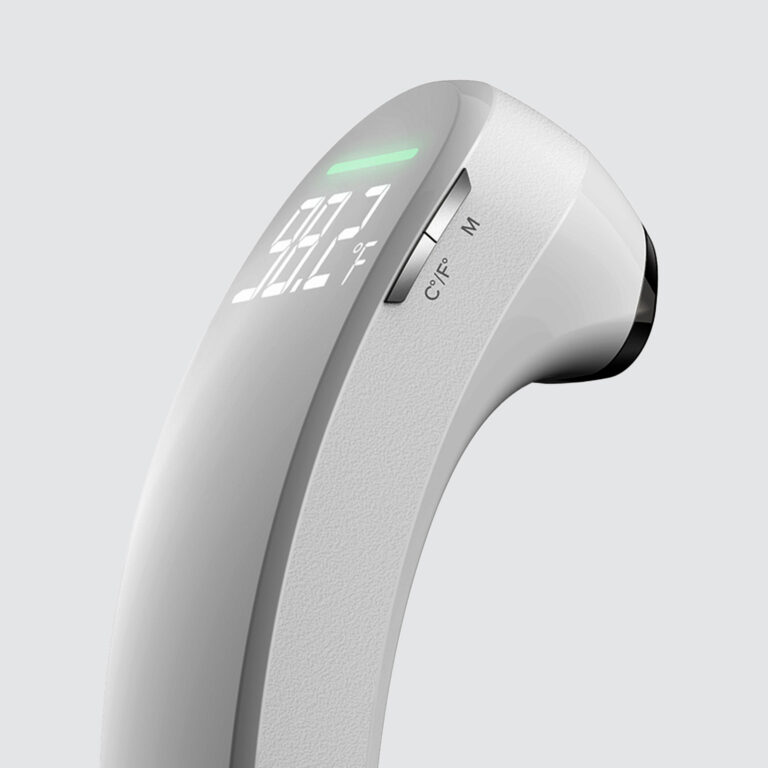
 Healthcare & Medical
 Consumer Electronics
 Consumer Electronics
 Branding & Strategy
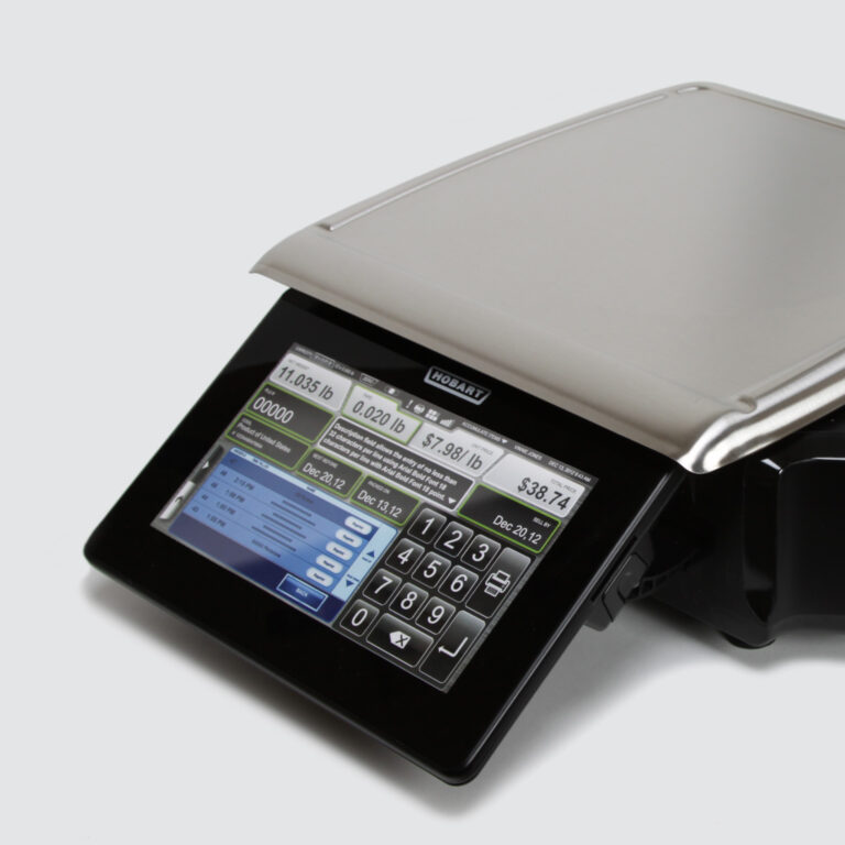
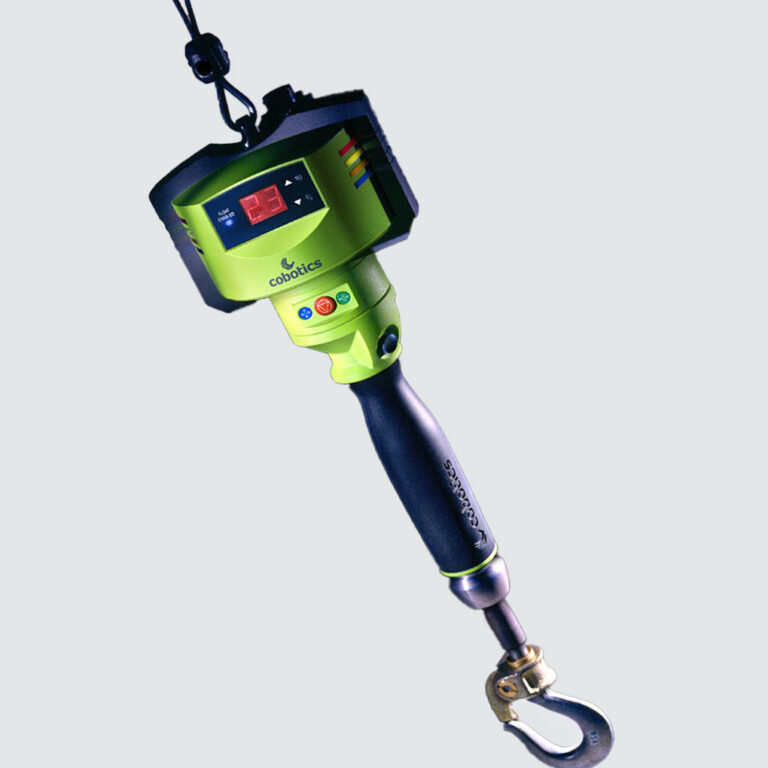
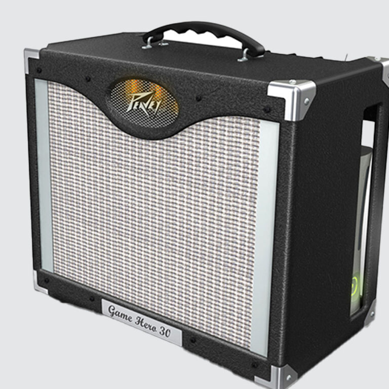
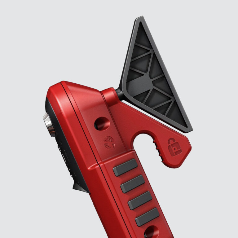
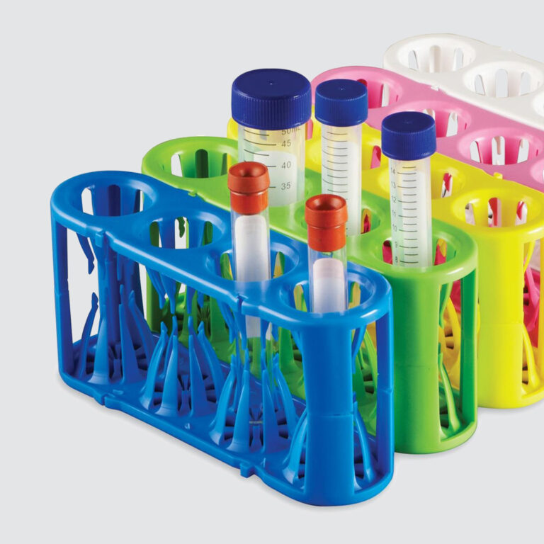
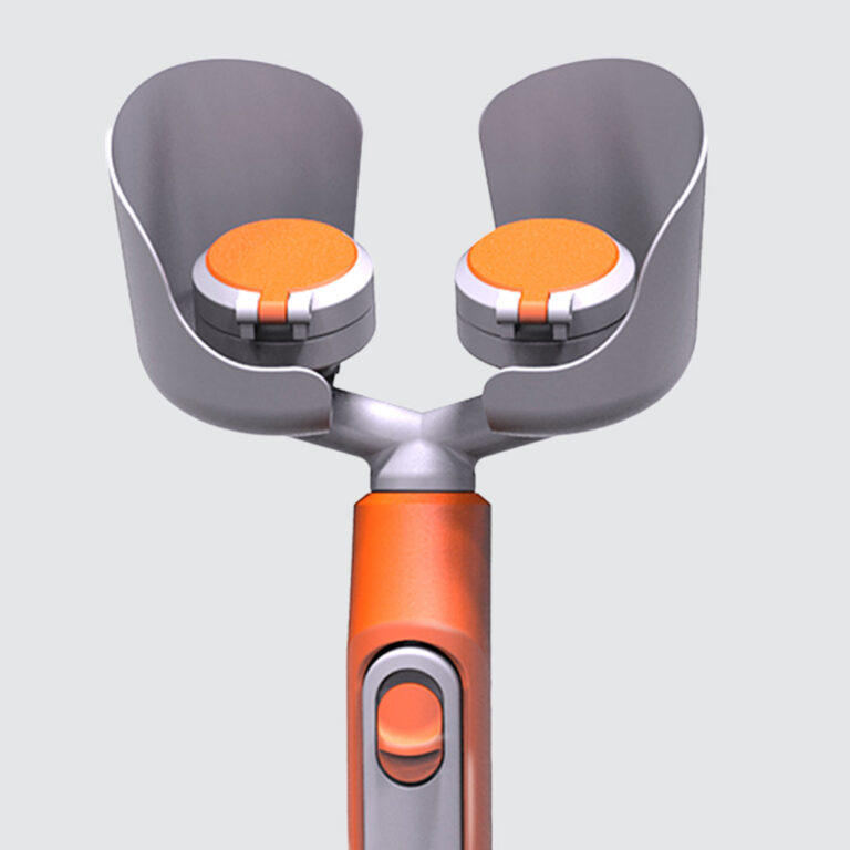
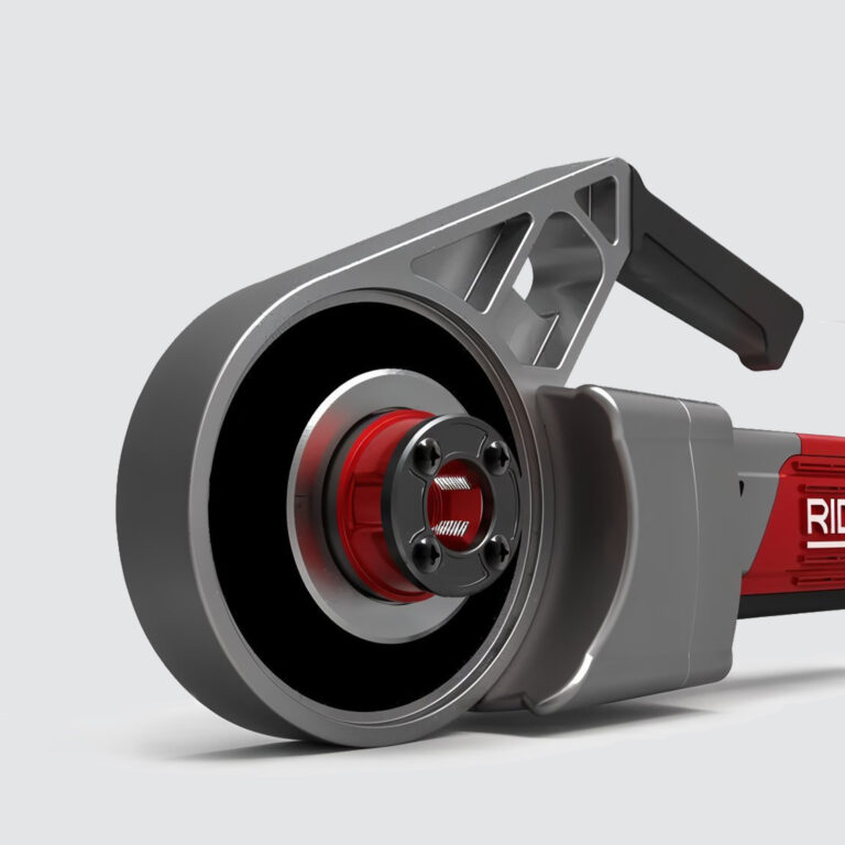
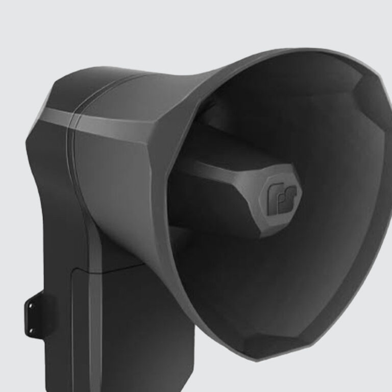
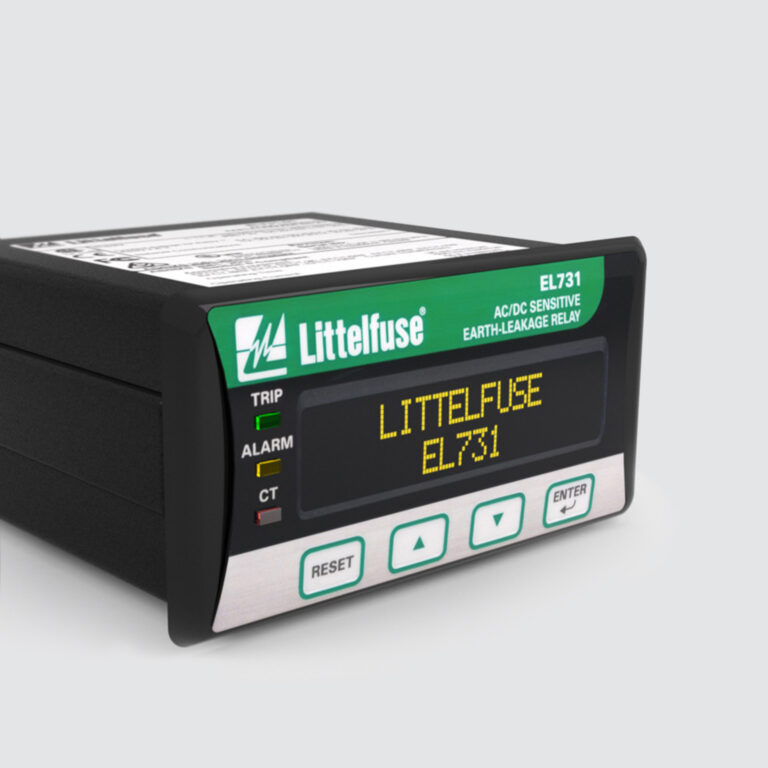
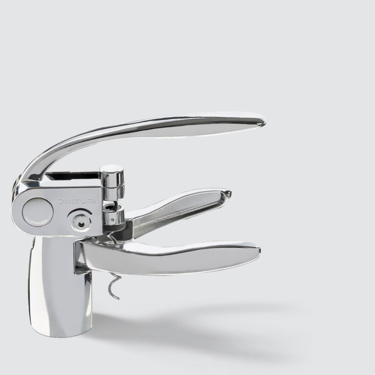
 Tools & Equipment
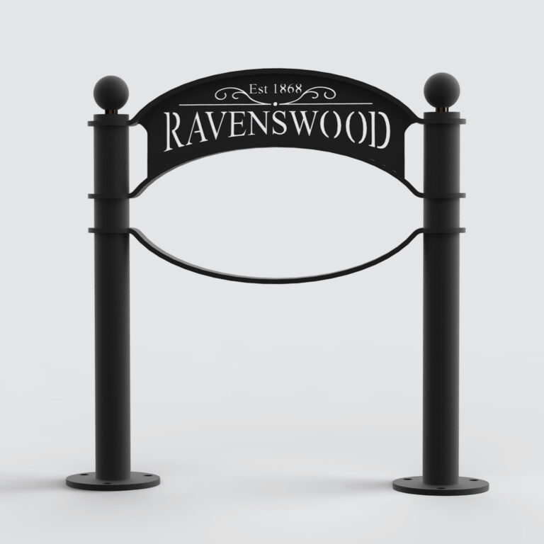
 Commercial
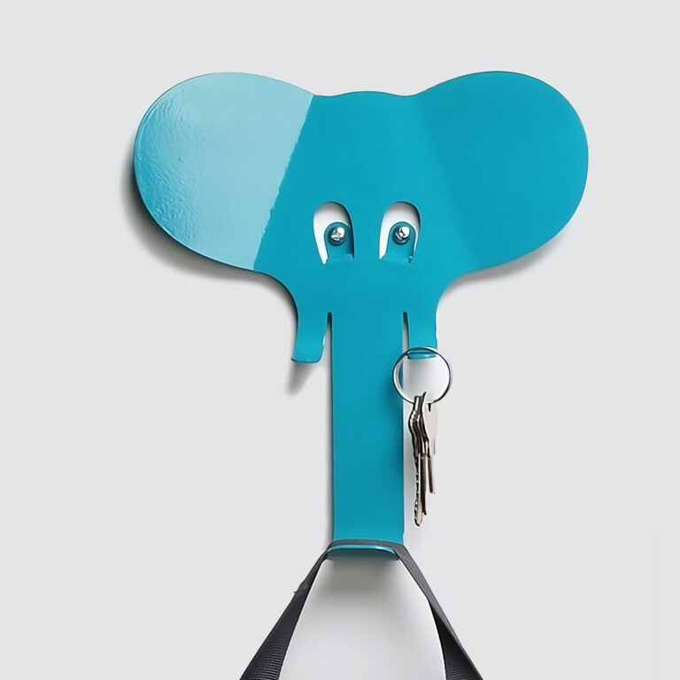
 Home
Home
 Home
Home
 Branding & Strategy
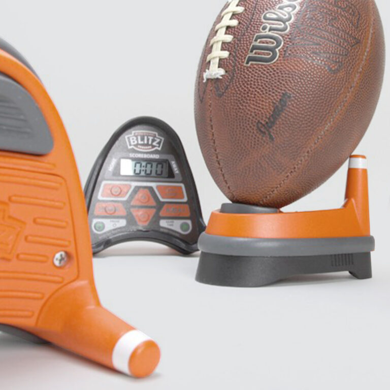
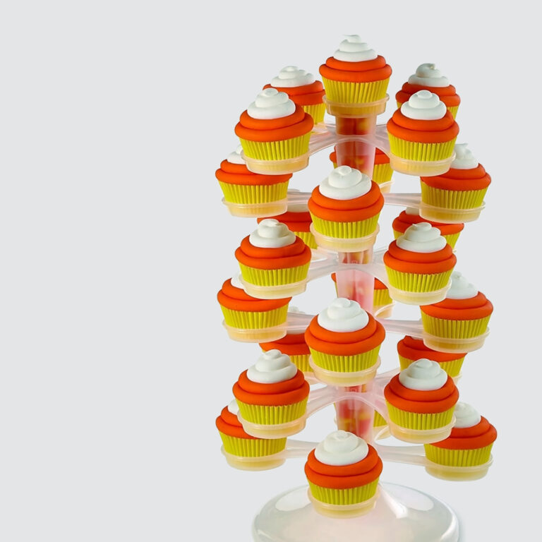
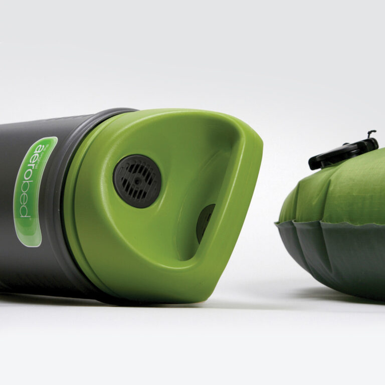 Leisure
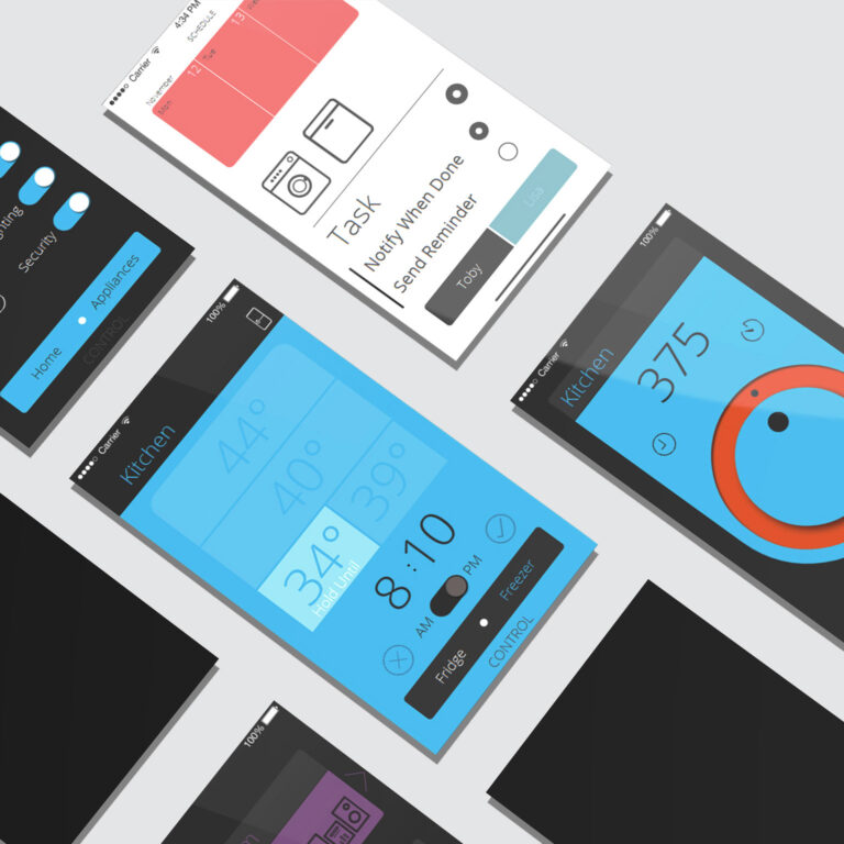
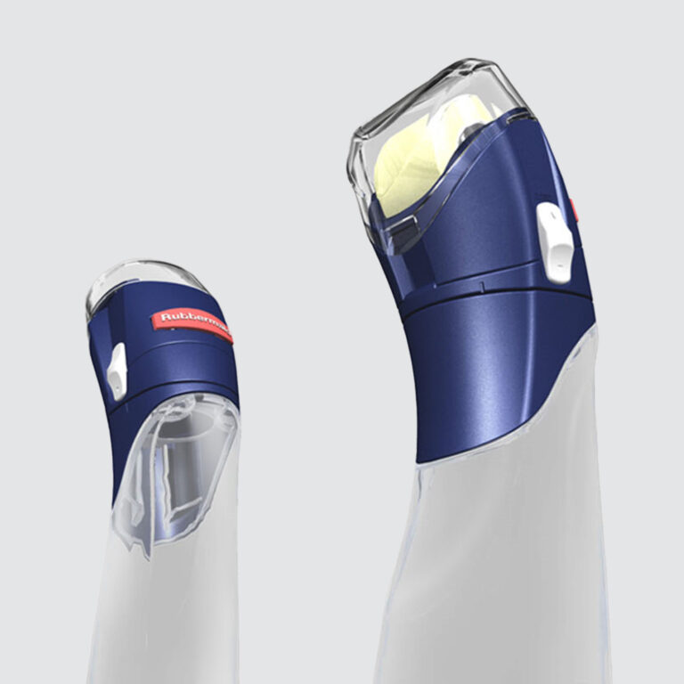
 Appliances
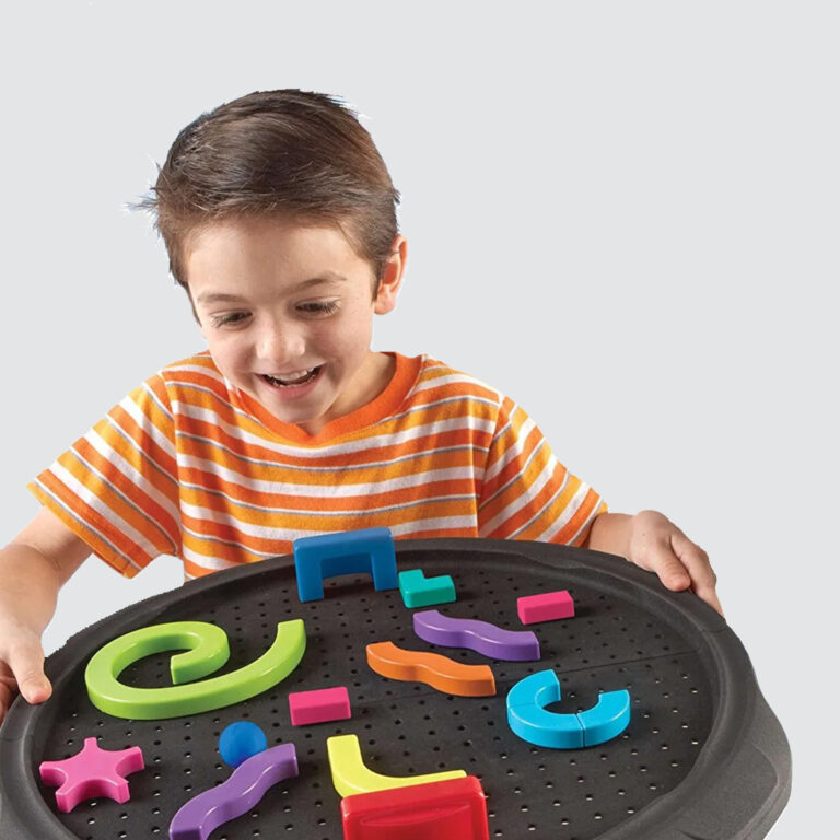
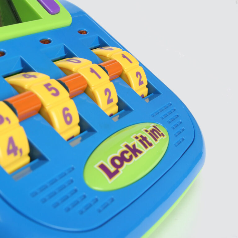
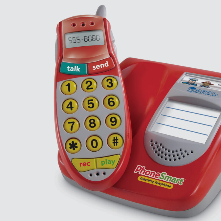 Education
 Branding & Strategy
 Branding & Strategy
 Leisure
 Home
Home
 Healthcare & Medical
 Commercial
 Tools & Equipment
 Branding & Strategy
 Healthcare & Medical
 Consumer Electronics
 Consumer Electronics
 Consumer Electronics
 Branding & Strategy
 Appliances
 Commercial
 Home
Home
 Healthcare & Medical
 Branding & Strategy
 Commercial
 Consumer Electronics
 Appliances
 Healthcare & Medical
 Consumer Electronics
 Education
 Home
Home
 Branding & Strategy
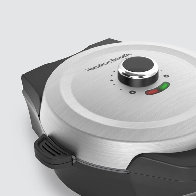
 Appliances
 Appliances
 Appliances
 Branding & Strategy
 Branding & Strategy
 Healthcare & Medical
 Consumer Electronics
 Commercial
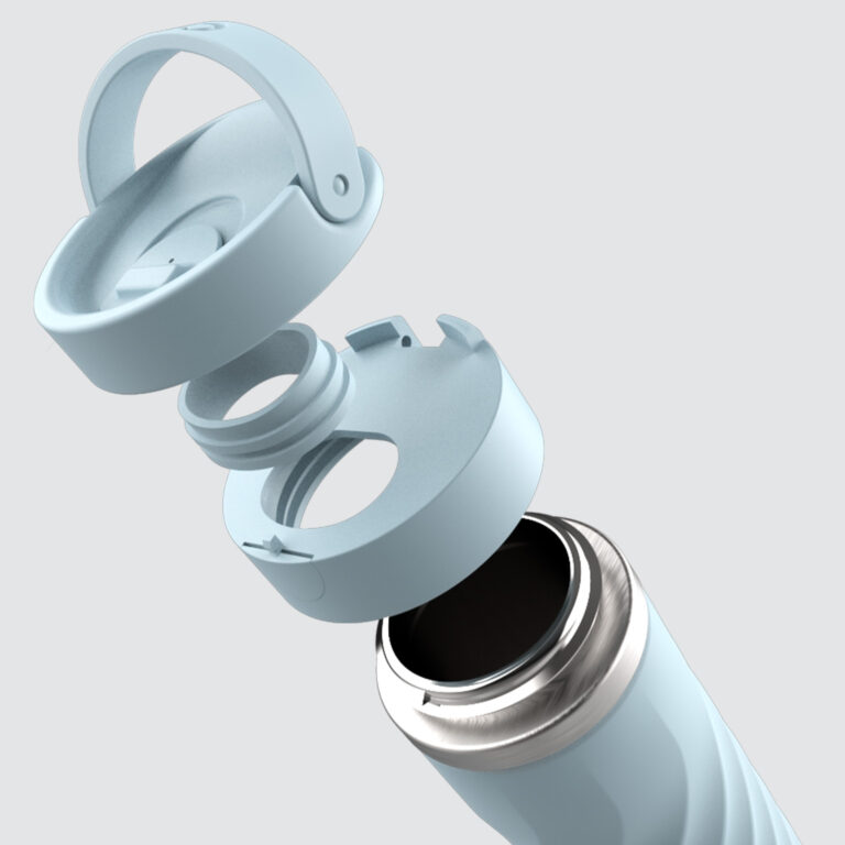
 Leisure
 Leisure
 Appliances
 Appliances
 Consumer Electronics
 Home
Home
 Branding & Strategy
 Commercial
 Consumer Electronics
 Education
 Branding & Strategy
 Appliances
 Appliances
 Appliances
 Appliances
 Home
Home
 Consumer Electronics
 Branding & Strategy
 Consumer Electronics
 Consumer Electronics
 Consumer Electronics
 Branding & Strategy
 Healthcare & Medical
 Appliances
 Leisure
 Branding & Strategy
 Branding & Strategy
 Home
Home
 Branding & Strategy
 Commercial
 Branding & Strategy
 Appliances
 Healthcare & Medical
 Consumer Electronics
 Branding & Strategy
 Home
Home
 Branding & Strategy
 Appliances
 Commercial
 Commercial
 Education
 Home
Home
 Appliances
 Consumer Electronics
 Commercial
 Appliances
 Branding & Strategy
 Branding & Strategy
 Education
 Home
Home
 Branding & Strategy
 Branding & Strategy
 Consumer Electronics
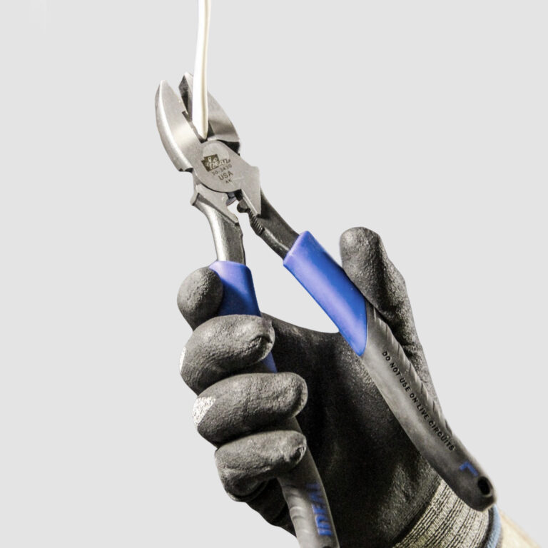
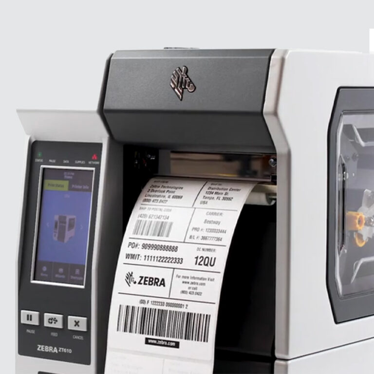
 Tools & Equipment
 Healthcare & Medical
 Home
Home
 Branding & Strategy
 Appliances
 Branding & Strategy
 Branding & Strategy
 Branding & Strategy
 Consumer Electronics
 Leisure
 Healthcare & Medical
 Branding & Strategy
 Branding & Strategy
 Tools & Equipment
 Healthcare & Medical
 Appliances
 Branding & Strategy
 Appliances
 Branding & Strategy
 Branding & Strategy
 Branding & Strategy
 Home
Home
 Consumer Electronics
 Commercial
 Branding & Strategy
 Home
Home
 Consumer Electronics
 Home
Home
 Tools & Equipment
 Tools & Equipment
 Top
Top
© Beyonddesign Inc. All rights reserved.
 Branding & Strategy
 Branding & Strategy
 Home
Home
 Healthcare & Medical