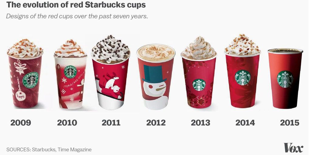
Starbucks Red Cup Design
Over the past few weeks, the world has been buzzing over the new Starbucks cup design. The coffee giant released its annual line of holiday cups, the normal red color that they always choose. However – some people have claimed that this is an outrage, having removed the religious reference for political correctness.
Starbucks sees the red cup controversy differently – releasing a statement saying that customers could bring their own imagination to the table, whether doodling on their cup or using their creativity.

Image By David Dewitt via https://thecozycoffee.com/best-starbucks-coffee-beans/
Starbucks values a culture of belonging, inclusion and diversity and for those of us who visit Starbucks on a regular basis, it shows. During the holidays, they want their customers to enjoy an experience that brings the spirit of the season alive – allowing all backgrounds and religions to feel welcome to their stores.
However, 2015 has been the year where minimalist designs are being welcomed and are more popular than ever. And that doesn’t exclude corporate big brands like Starbucks, obviously. Clean and simple designs portray confidence and removing the clutter of everyday life is what people are after, even with products that sometimes we don’t even think twice about.
The new design is a drastic change from the skeuomorphic design trends of the early 2010’s. The real test will be to see if Starbucks chooses to keep the new design for next year, or if they will design a more “Christmas-sy” design.
There’s always a back story when it comes to design and in this case, Starbucks came out on top.


 Top
Top
