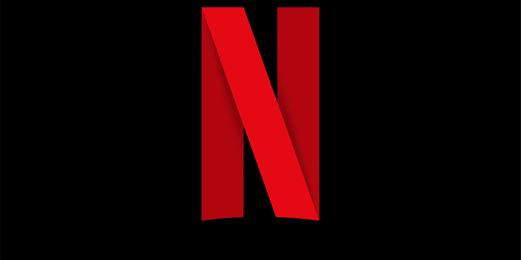
Netflix Reveals their New App Logo
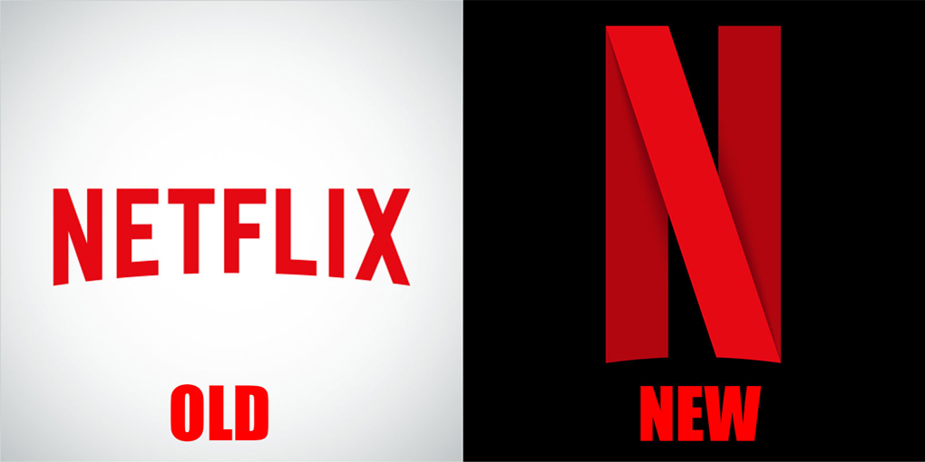
Netflix, the most popular streaming provider for films and television shows, released their new app logo for mobile apps and social media platforms. A simple “N” with a red band that folds over itself like a strip of film is the new logo – and you can interpret it however you like.
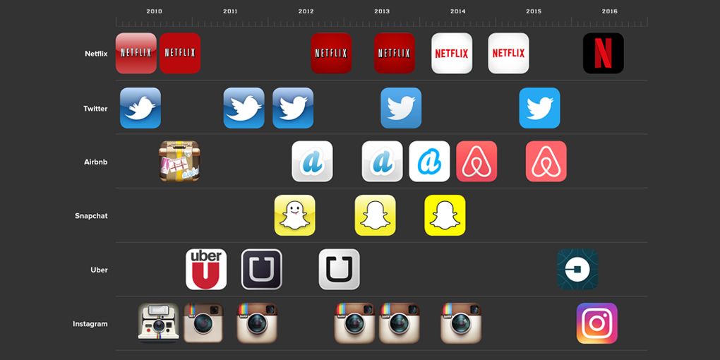
As a side note, Netflix did not get rid of the old logo. The wordmark will still be used on different platforms. With more and more tech companies like Uber, Twitter and Airbnb, looking to update their visual brand for mobile applications – the viable option for Netflix was to follow suit. As technology devices change over time with the capabilities improving, companies want to grow with the times and continue to look good with the changing context of applications.
Minimal and simplistic icons have gained popularity over the past year or two – and as designers would call it, “skeuomorphism”. With a drop shadow and a bolder, simpler icon on your home screen of your smartphone or tablet – this will help you pay more attention to the tapping and clicking you do to connect to what you want to see. Simplicity is the name of the game now when it comes to logo app design.
To learn more on our user experience capabilities, please ![]()
 Top
Top