The Meaning Behind Those Logos
In the world of design, logo design & branding is one of the key pillars of a company’s identity. There are always logos that have a hidden meaning behind their design – some of which have been pointed out below and on Twisted Sifter’s website (all logos shown below are from their site). A few of our favorites are below.
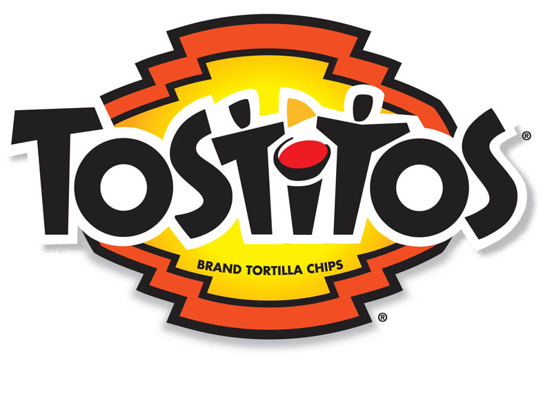
Who knew the logo was where the party’s at? The two “T’s” of this logo make up people, as they dip a tortilla chip into the bowl of salsa in the ‘I’.
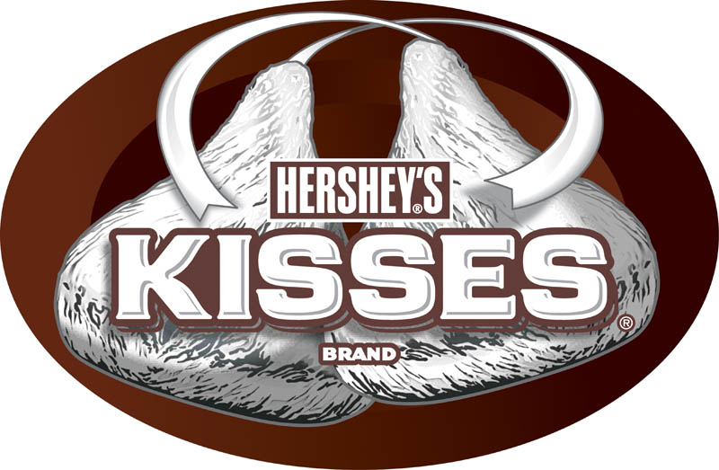
The Hershey’s Kisses logo is similar to the FedEx logo in that there is a hidden Hershey’s kiss between the ‘K’ and the ‘I’.
Did you ever notice the arrow from ‘A’ to ‘Z’ in the Amazon logo? The thought is that Amazon carries everything from…. well you know the rest.
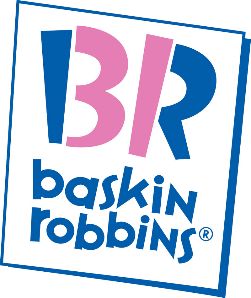
The BR in the Baskin Robbins logo is made of two colours. When you focus on just the pink portion, the number 31 appears, denoting the number of flavours Baskin Robbins offers.
To check out the rest, click here.


 Top
Top
