
Instagram’s New & Improved Logo
Instagram just released their new logo and there is a major upheaval – as people want it to go back to the original style. Before Instagram became ever so popular, the app logo actually looked like a polaroid camera, but changed it because it had nothing to do with the picture filter app. Here’s where Cole Rise steps in and takes over to create and develop one of the most recognizable app logos to mankind.
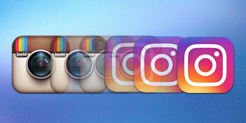
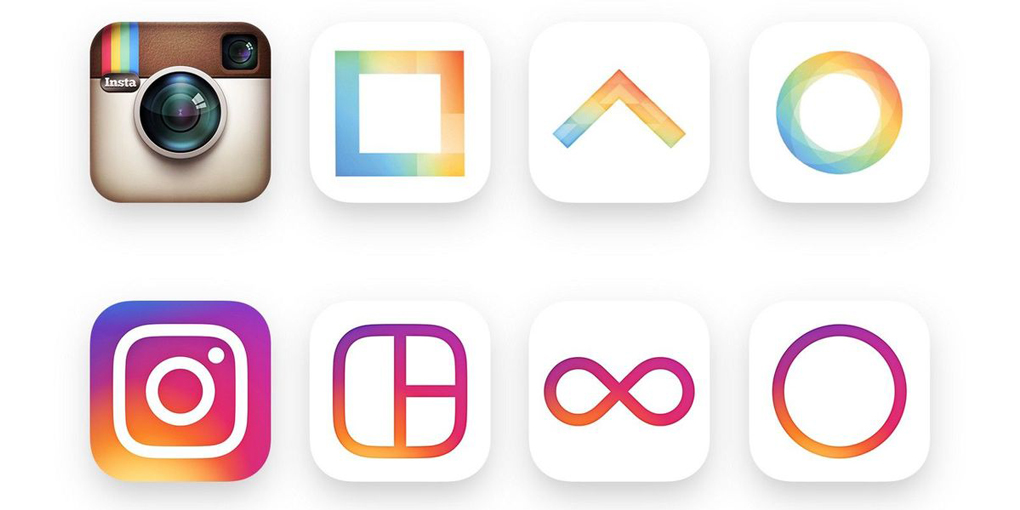
The new logo represents minimalism, along with showcasing several different colors. It’s stylish, edgy and still has that Instagram look to it. More and more apps are developing new logos to reveal, like Uber.
When Instagram was first released via Apple in 2010, there was a problem: they couldn’t use the the Polaroid camera as their logo due to trademarking. Taking a previous logo that Cole did for “Uooo”, they touched it up and re-designed it for Instagram’s use. Over the past six years, the Bell & Howell inspired logo has become synonymous with the picture filter app.

To learn more about Beyond Design and our user experience capabilities, please ![]()
 Top
Top