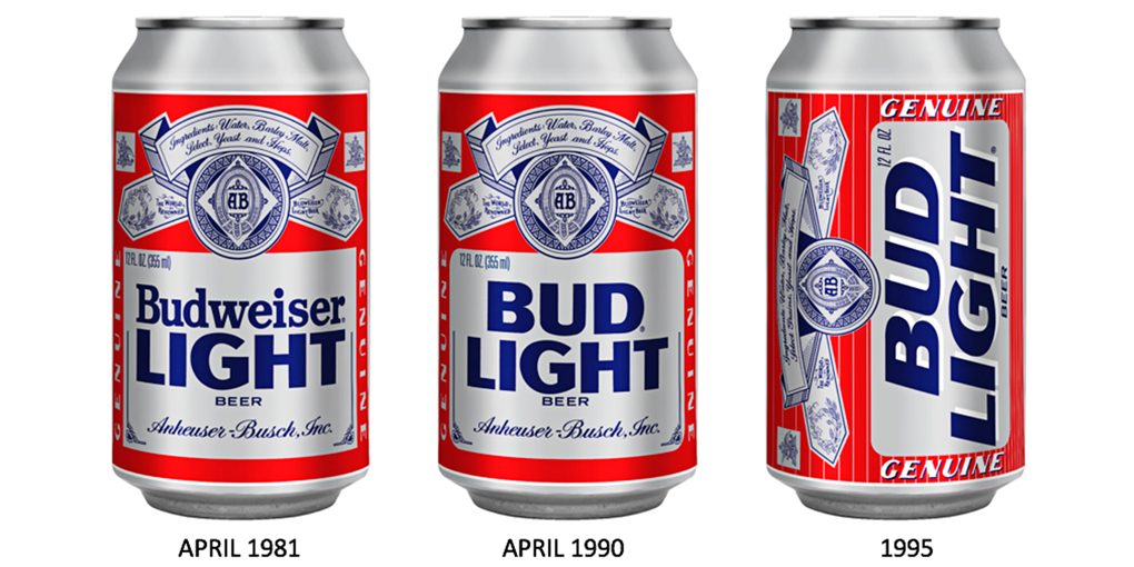
Bud Light Looks for that Retro Love
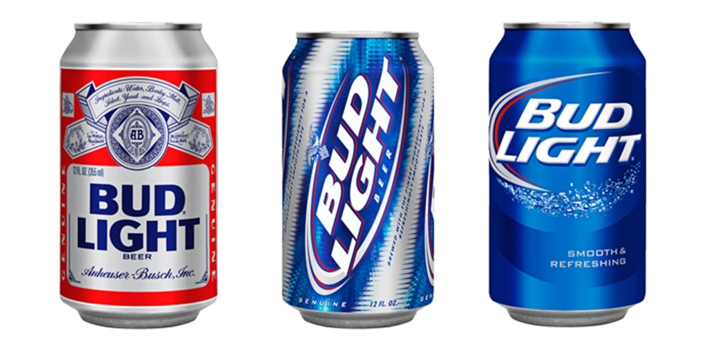
Bud Light has a new adult look for their beer can design. It’s still blue, but it’s missing that swoosh on the past design. The typeface is different – focusing on a bold face look instead of the italicized font.
The design hasn’t been changed in eight long years. The vintage design has been happening across industries, resulting in changes for both Miller Lite and Coors Lite as well. Reintroducing the design is more about humbler designs, being low-key and not so hyped up about football and man-cave Sundays.
Simplified designs are a large trend in the design industry, seemingly paying off. And Bud Light wants to get some of that action as well, especially in sales.
Looking forward to seeing this design out on the shelves this spring.


 Top
Top
